Helm
Summary
Helm was designed to help people better make use of the health data available to them.
In 2014, health wearables were just becoming affordable enough for mass adoption. Despite the many solutions starting to flood the market, however, there was no efficient way to consolidate and generate conclusions from all of this data.Because there was no way to get all of the data into a single place, it made it very hard for users to see the extent to which their data is connected.
Original Wireframes
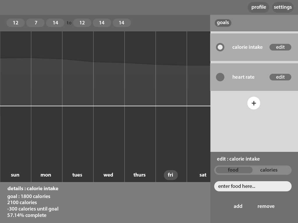
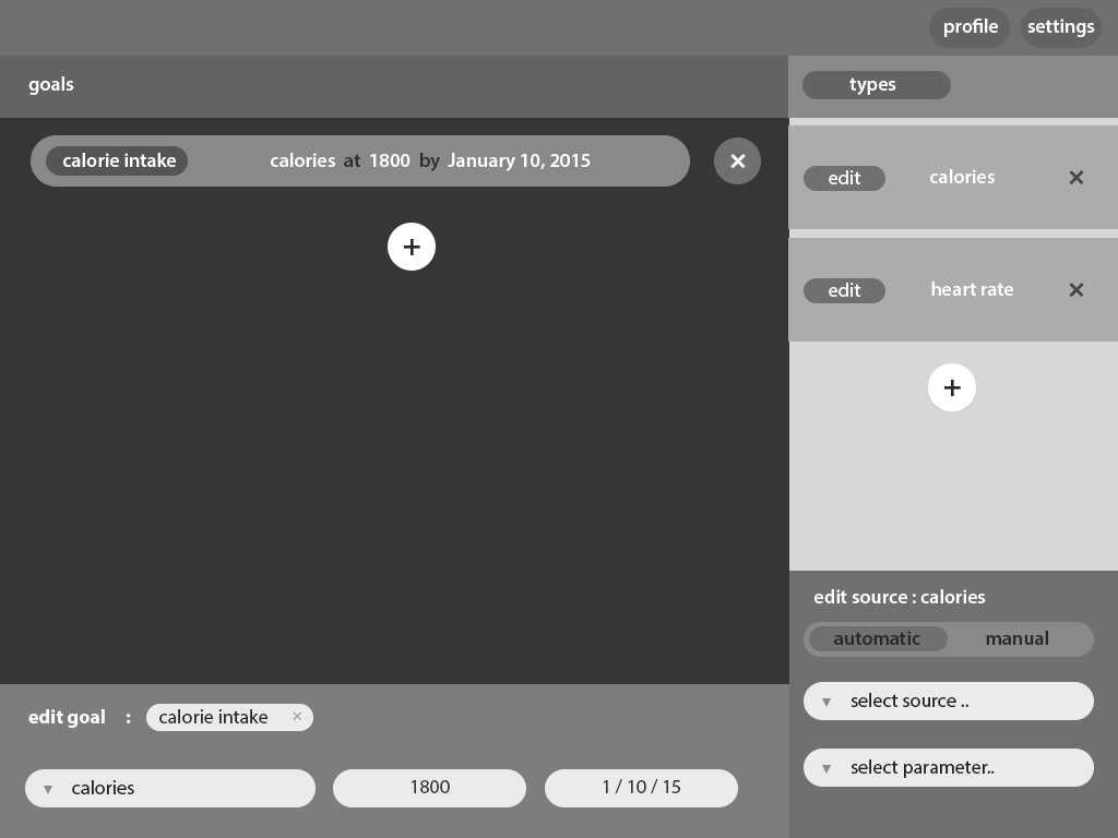

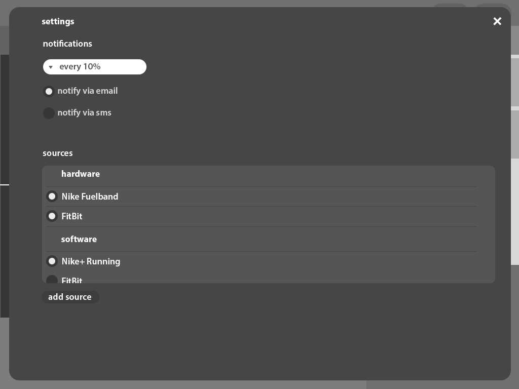
As time went on, official solutions began to appear to address this problem. Google Fit, Apple Health, and other similar built-in solutions started to become available to users. While I was glad to see solutions being implemented, It helped me realize that the user experience of health technology still had a long way to go.
In 2016, I revisited this project, with the intentions of finding a more appealing and effective way for users to track their activity.
Version 2
I realized that a lot of these companies have shifted over the past few years to target the fitness market, leaving the pure health market somewhat neglected. To try and get an accurate picture of the problem at hand, I interviewed some people who relied on health wearables for both personal and medical reasons, and I tried to cast as wide a net as I could for age and background. Through these interviews, there were a few key takeaways:
- Older users often felt the need to ask family members or doctors to explain results or data patterns
- Younger users often didn’t know their medical history and the effects it has on their current health
- Users of all ages rely on online sources to diagnose issues or problems with their health
One of the points that stuck with me was the first: the need to ask others for help understanding their data. To see how widespread this issue was, I decided to run a test. I used people’s health tracking apps and showed them some of the data that their wearables were collecting to see if they would be able to actually draw any conclusions from this data (or even recognize it for that matter). After the test, only a few of the 20 participants were actually able to recognize the data and derive value from it. After this, I made the decision to focus my efforts on this problem.
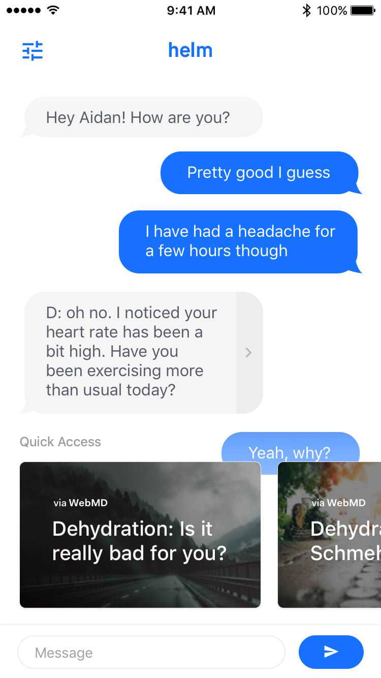
I did some brainstorming to figure out what practices I could use to solve this issue, and one thing that kept coming up was the idea of conversational interfaces. While they are still in their early stages, conversational UI has stood out as a very effective way of building trust with users, and when executed well, can provide a very personal and meaningful experience. The big issue with this, however, is that people are typically using these technologies through another messaging service, which would make it impossible to connect with wearables.
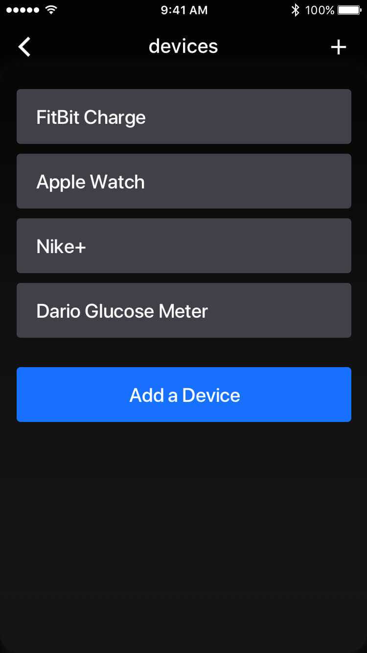
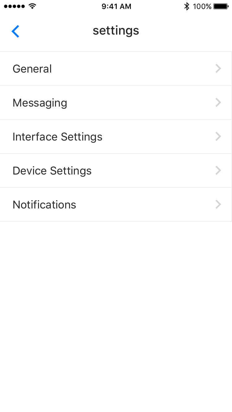
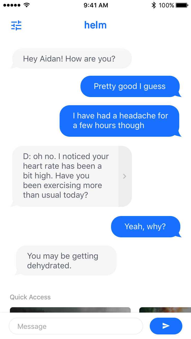
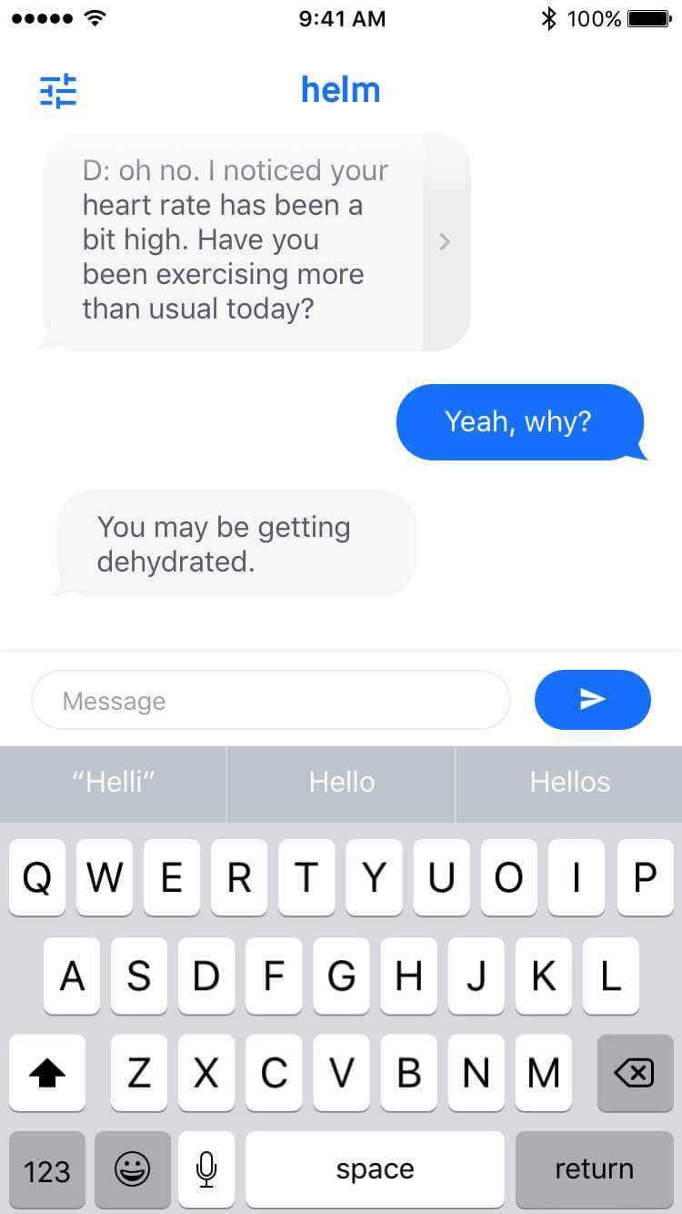
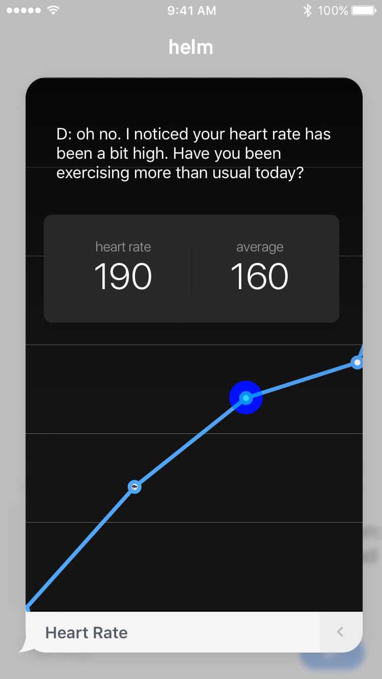
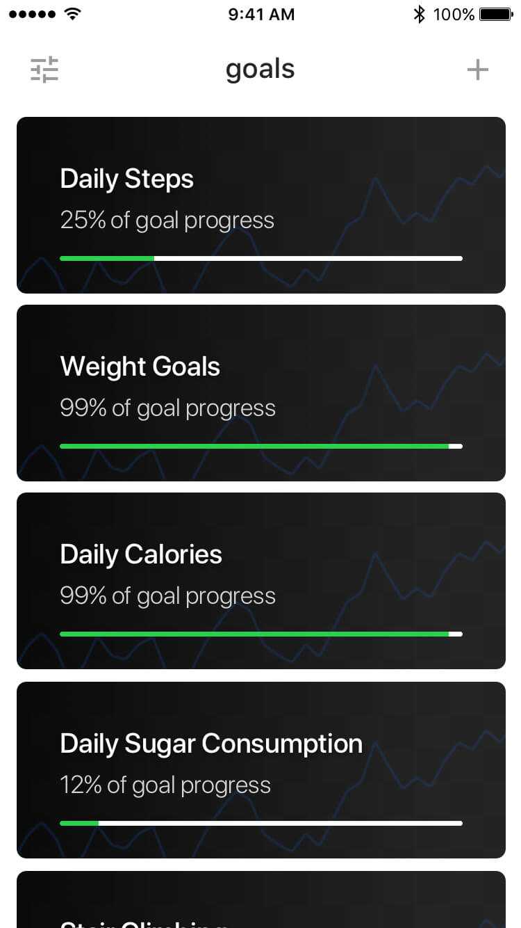
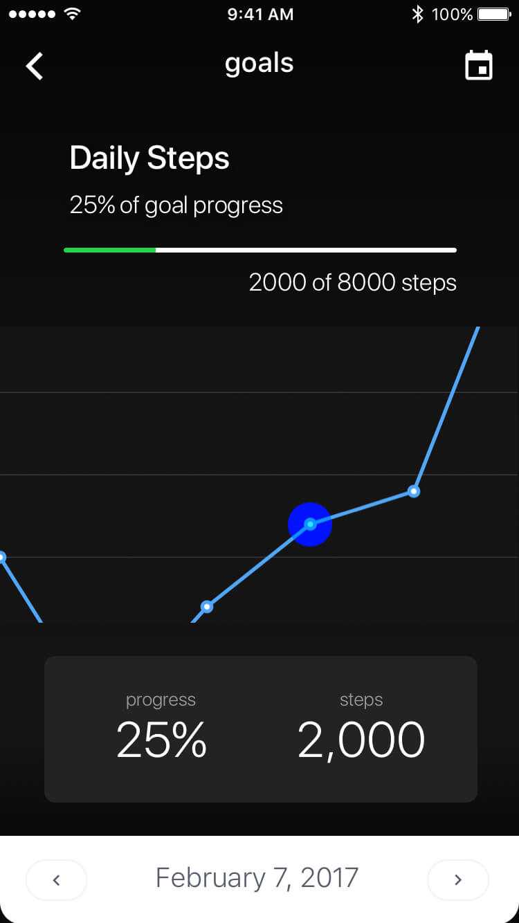
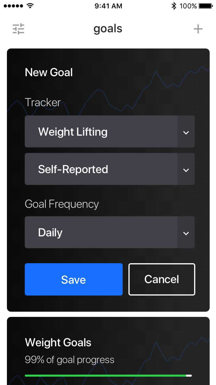
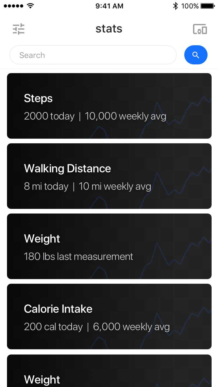
The solution I decided on was a standalone app with a set of focused, goal-oriented interfaces all tied into a conversational homepage and dashboard.
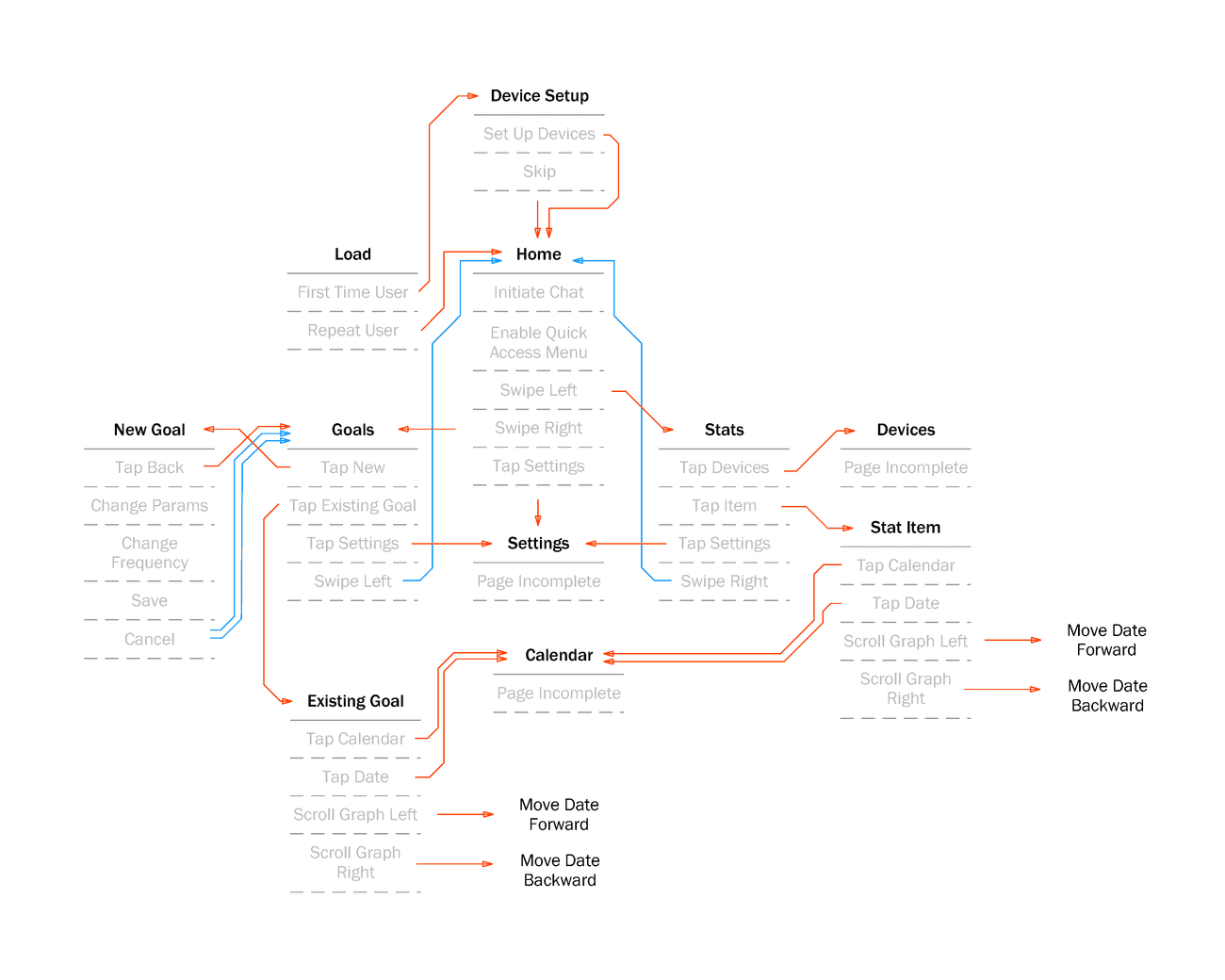
Application Architecture
Final Screens
-f4d0d00bdfe2b27f73cb4ba833718163-1fec8.jpg)
-acf6ddd8d21658977222b11f0043b100-1fec8.jpg)
